responsive design
Figma Styles
WCAG Guidelines
Color Contrast
UX Laws
Cognitive Load
User Flow
Interaction Design
UI UX Principles
Figma
Component Library
Figma Advanced
Figma Auto Layout
UI Foundations

Why Do Some Apps Feel Effortless to Use?
Have you ever noticed how apps like Spotify, Instagram, or Amazon feel incredibly smooth to use? You rarely tap the wrong button, and completing an action feels almost effortless. This isn't just good visual design—it's the result of thoughtful UX principles working behind the scenes.
One of the most important principles responsible for this experience is Fitts's Law. It helps designers create interfaces that are faster, easier, and more comfortable to interact with.
What is Fitts's Law?
Fitts's Law states that the time required to reach a target depends on two things: its size and its distance. Larger targets are easier to click or tap, while closer targets require less effort to reach.
In simple terms, a large button placed within easy thumb reach is much more user-friendly than a small button placed in a difficult-to-reach corner.
Although the concept sounds simple, it influences almost every successful digital product we use today.
Why Does It Matter?
Every interaction in an interface requires physical effort. When users struggle to tap a button or accidentally press the wrong element, the experience becomes frustrating.
Designing larger touch targets and placing important actions where users naturally expect them reduces friction. This not only improves usability but also helps users complete tasks more quickly and confidently.
Good UI design isn't about making users think harder—it's about making interactions feel effortless.
A Practical Example
Imagine you're designing a food delivery app.
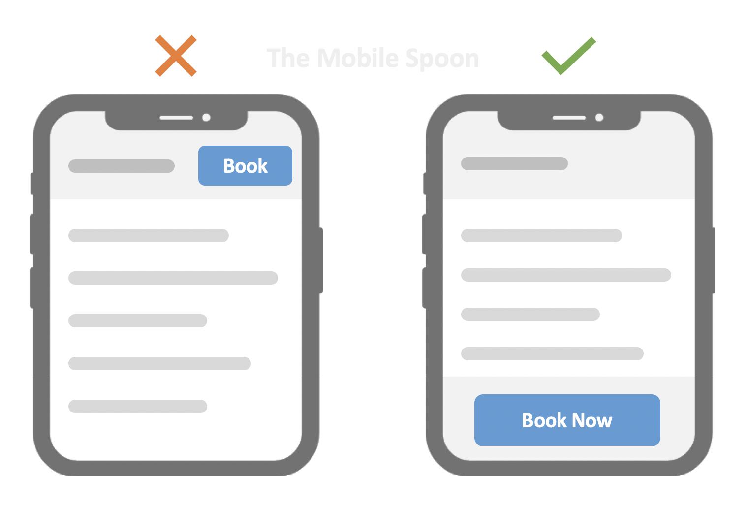
In the first version, the Place Order button is small and positioned at the top-right corner of the screen. Users holding their phone with one hand need to stretch their thumb every time they want to complete their order.
Now imagine moving the same button to the bottom of the screen and increasing its size. Suddenly, placing an order feels much faster and more comfortable.
The functionality hasn't changed—but the experience has improved dramatically. That's the power of Fitts's Law.
Where Should You Apply Fitts's Law?
Fitts's Law should influence every important interaction in your interface. Primary CTA buttons, navigation items, floating action buttons, form controls, and frequently used icons should always be easy to reach and large enough to tap comfortably.
This is one of the reasons why many modern mobile apps use bottom navigation. It places commonly used actions within the user's natural thumb zone, making everyday interactions quicker and more intuitive.
Common Design Mistakes
Many beginner designers spend hours perfecting colors, typography, and shadows but overlook usability. Tiny icons, closely packed buttons, or important actions placed in hard-to-reach areas may look visually appealing but often create unnecessary friction.
Another common mistake is designing for appearance instead of real-world usage. A beautiful interface loses its value if users struggle to interact with it.
Best Practices
Think about how people actually hold and use their devices. Make primary buttons larger than secondary actions, provide enough spacing between interactive elements, and avoid placing critical actions in corners that require excessive thumb movement.
Whenever possible, test your designs on an actual phone instead of relying only on the design canvas. Small adjustments in placement and size can significantly improve the overall user experience.
Conclusion
Fitts's Law reminds us that great UI design isn't just about aesthetics—it's about reducing effort. Small decisions like increasing button size, improving spacing, or positioning important actions within easy reach can make a noticeable difference in how users experience a product.
Whether you're designing a mobile app, website, or dashboard, applying this principle will help you create interfaces that feel more natural, accessible, and enjoyable to use.
Designer Takeaways
Design for usability before aesthetics.
Keep primary actions large and easy to reach.
Maintain enough spacing between interactive elements to reduce accidental taps.
Place frequently used actions within comfortable thumb reach.
Test your layouts on real devices to ensure interactions feel effortless.
If you'd like to explore concepts like Design Systems, Design Tokens, Typography, Auto Layout, Components, Accessibility, and UX Laws in greater depth, Design Mastery brings them together in a practical, step-by-step learning experience.